The Definitive Guide to the Raycasting Game Maker
Artwork Atlas - Update #2
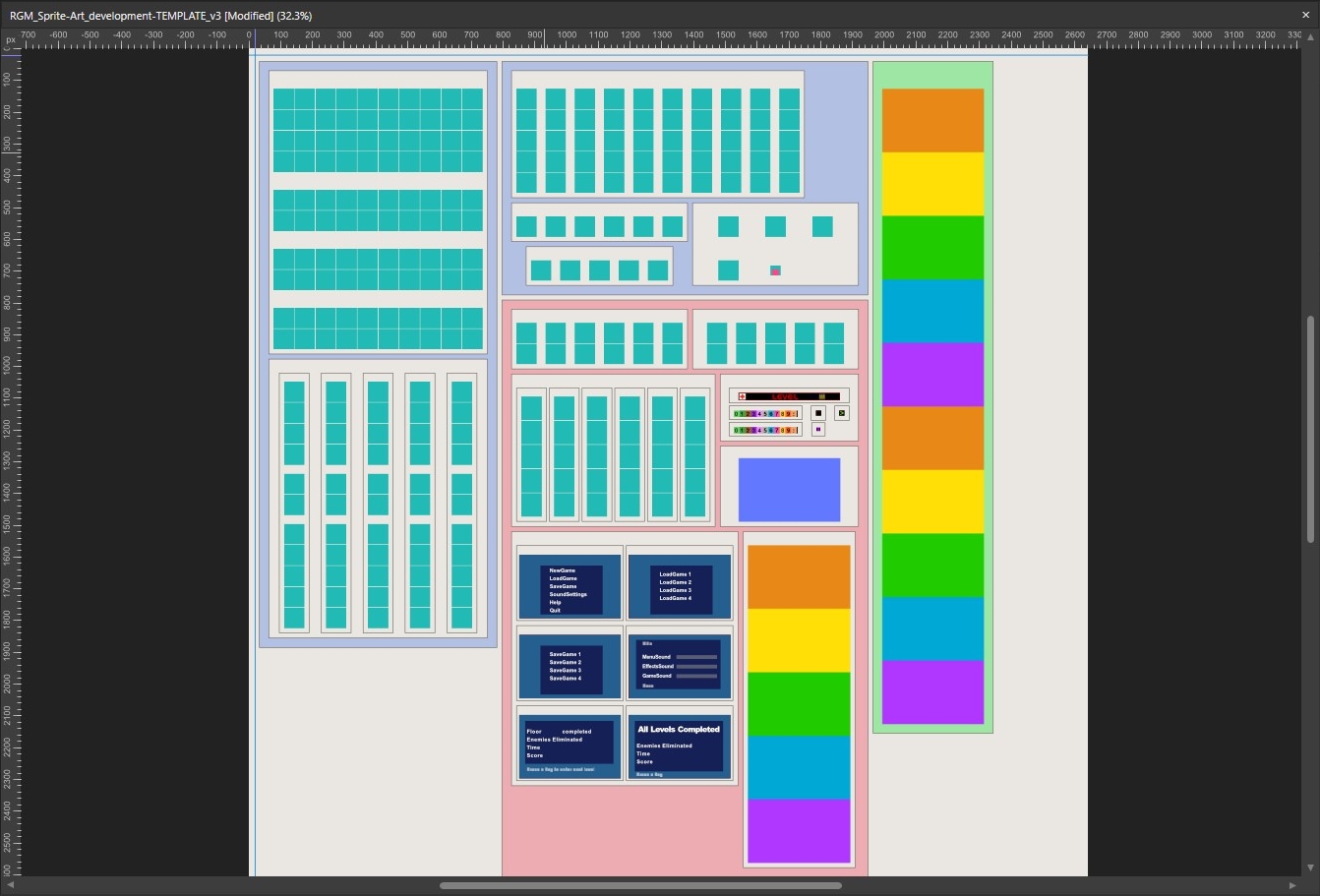
So as of today, the Art Atlas has gone through several small changes.
I ended up using a lot more pink and purple cubes and blocks to help align everything in uniform increments. Every section is separated from every other section by repeatable amounts, so there's a good amount of padding on each box.
The overall theme is to kind of match the look of the software, just like the little icons I made for the cover of the guide, but add some extra detailing and notes so you know what each section is and how they all relate.
The purpose of each background color is to let you know where each group of images is meant to go.
- BLUE represents artwork that is imported inside of RGM in each of the drop down tabs from the Tool Bar.
- RED represents artwork that has to be copy/pasted into the GameBitmaps folder or created using the MenuMaker add-on program.
- GREEN represents the cutscene artwork, which has to be imported using the other add-on program, CutSceneMaker.
Rather than use any of the default artwork here, I've chosen to use either solid colors, or my own overlays that match the defaults, primarily for the Menu screens. Instead of making the Help Menu and Cutscenes in rainbow, though, I think I might change those to a repeating sequence of grays. Though I might change the whole color scheme to be more appealing and cohesive.
One last element I just though of, is I ought to put an indicator next to each piece of menu text that shows you exactly where the "menuicon," "volumebutton," and "scorenumbers" go on each screen, that way you can design around them more easily. I'll then add a little note above the menu images to let you know that this specific color block represents those different items from the accessories block above.
Get The Definitive Guide to the Raycasting Game Maker
The Definitive Guide to the Raycasting Game Maker
If you're having trouble learning how to use the RGM, this guide has it all.
| Status | Released |
| Category | Other |
| Author | FilmGamerJ |
| Tags | FPS, gameengine, guide, raycasting, rgm, Tutorial, wolfenstein |
More posts
- 100 Downloads Achieved!Feb 09, 2023
- Artwork Atlas - Now Included!Dec 24, 2022
- Guide Additions & My 1st RGM GameDec 16, 2022
Leave a comment
Log in with itch.io to leave a comment.